MEC Gloves

Packaging Design

About This Project

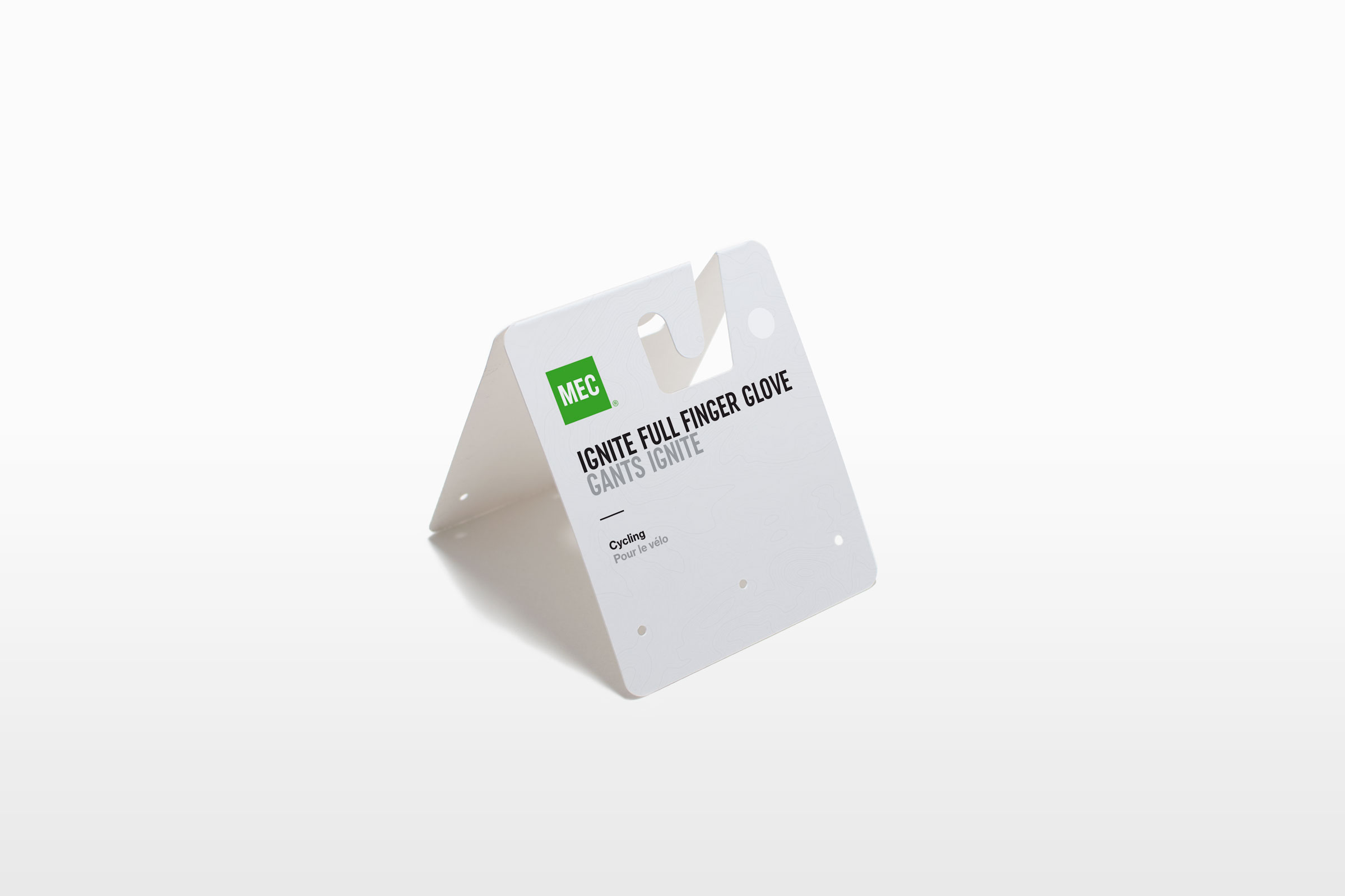
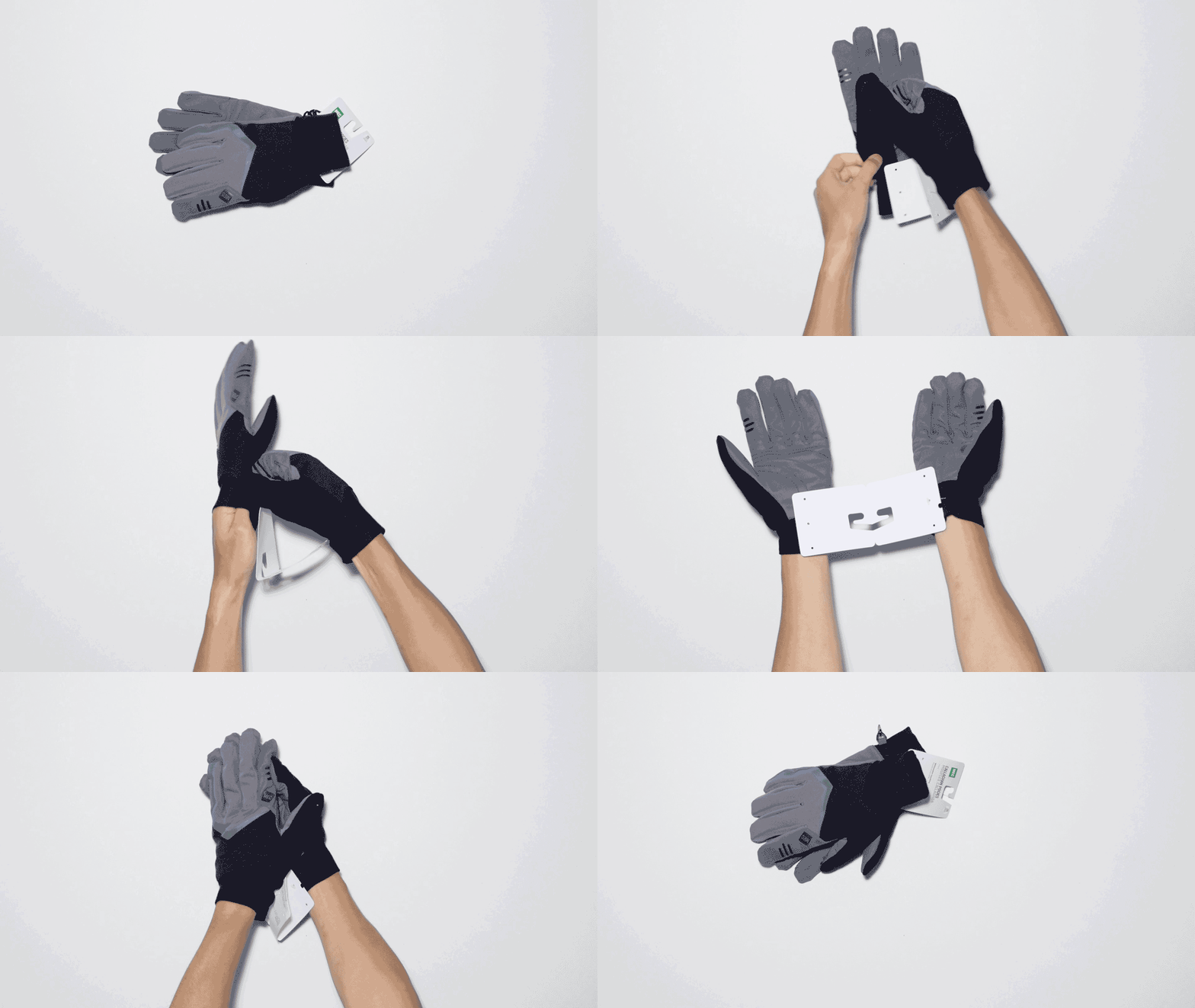
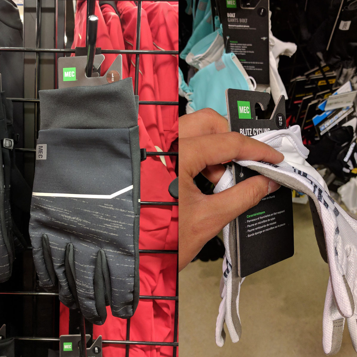
One of the biggest problems with MEC’s glove category was packaging damage from shopper’s interaction. Customers often find themselves in an awkward handcuffed situation when trying on the product and breaking the packaging by accident. The new design improves this shopping experience, allowing shoppers to try on the product with ease. The simple structure update solves an age old problem in the gloves category; furthermore, reducing costs, making this update a big win for MEC.

Challenge

Improve in-store shopping experience.

Solution

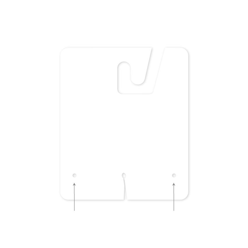
A fold out structure update that is more ergonomically friendly & structurally sound.

Role(s)

Packaging Design – Andrew Zo

Medium

Card Stock

Client

MEC

ERGONOMIC
DESIGN

Pain-free try-on experience.

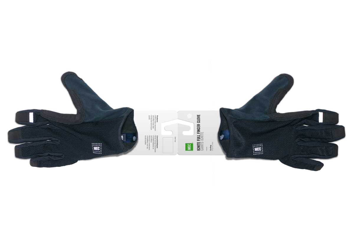
ONE SIZE
FITS ALL

Designed to accommodate various styles & sizes.

BACKUP READY

When a hole punch has been damaged on the store level, additionals can accommodate.

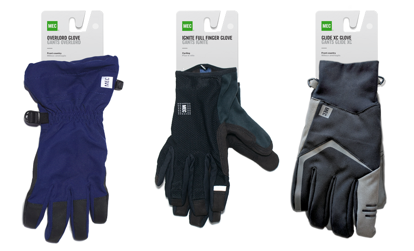
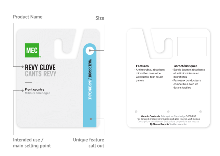
EASY TO FIND INFO

Priority information front and centered.
Secondary detail on back.

OLD
DESIGN

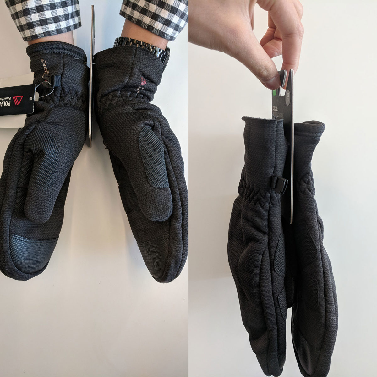
AWKWARD EXPERIENCE

Handcuffed situations prevent shoppers from trying.


Old design would often break when shoppers are trying on the product.

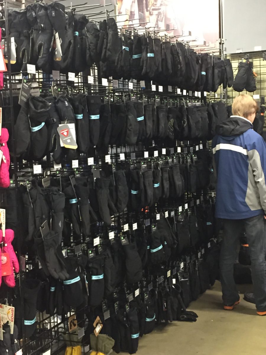
TOO DARK

Packaging background colour blends into the product


This in-store photo shows how difficult it can be for a shopper to purchase a pair of gloves.

INCONSISTENCY

Product information are placed differently from product to product.


It can become tiring very quickly if one has to pick up each glove in order to learn about the product.

IN-STORE
PHOTO